React functional component patterns
👋 Hi there, I'm Robin! I am a web developer who loves to build indie projects on the side. Building projects on open source and I write about web development, side projects, and productivity.
With newer versions of React focusing more on functional components, hooks and context, it is time that we re-look some of the component patterns in react.
Components are the heart of React, so understanding how to utilize them is paramount to creating an effective design structure. In this article, we will be looking at some popular design patterns for building React components.
1. Render props pattern
This is one of the simplest component patterns. Here you pass components as props to your parent component and the parent component takes care of rendering it in the right place.
A render prop is a prop on a component, whos value is a function that returns a JSX element. The component simply calls the render prop at the right place within the template.
Let's look at a sample Modal component. We want your Modal component to display a custom Title and Footer based on the page they are called. The render props pattern is what we will use here.
Usage
<Modal title={<CustomModalTitle />} footer={<CustomModalFooter />}>
CustomModalTitle and CustomModalFooter are components specific to the page that the user passed to the Modal component. `Modal component accepts them as props and renders them appropriately.
Implementation
export const Modal = ({ title, footer, children }) => {
  return (
    <div className="modal">
      <div className="modal-title">{title}</div>
      <div className="modal-content">{children}</div>
      <div className="modal-footer">{footer}</div>
    </div>
  );
};
Lifting state up
Through the render prop pattern, we can also pass internal data from the parent Modal component to the incoming render prop elements.
export const Modal = ({ title, footer, children }) => {
 const data = { ... }

  return (
    <div className="modal">
      <div className="modal-title">{title}</div>
      <div className="modal-content">{children}</div>
      <div className="modal-footer">{footer(data)}</div>
    </div>
  );
};
The render prop can now receive this value like this:
<Modal
        ...
  footer={(data) => <CustomModalFooter data={data} />}
>
Children as a render prop
Besides regular JSX components, we can pass functions as children to React components. This function is available to us through the children prop, which is technically also a render prop.
Let's update our example so that we also pass our internal data value to children as well.
export const Modal = ({ title, footer, children }) => {
 const data = { ... }

  return (
    <div className="modal">
      <div className="modal-title">{title}</div>
      <div className="modal-content">{children(data)}</div>
      <div className="modal-footer">{footer(data)}</div>
    </div>
  );
};
Calling the Modal component can be changed to this:
<Modal ... >
  {(data) =>(
      <div>
        Hello, {data.name}
      </div>
    )
  }
</Modal>
Here's this component in action:
Pros
- Simple to implement and understand.
- Sharing logic and data among several components is easy with the render props pattern. Components can be made very reusable, by using a render or
childrenprop.
Cons
- No control over what users pass as render prop.
- Quite difficult to achieve tight logic sharing between render prop elements and parent component.
2. Compound component pattern
The compound components are a set of two or more components that work together to accomplish a specific task. The set of components will share an implicit state to communicate between them.
Think of compound components like the
<select>and<option>elements in HTML. Apart they don’t do too much, but together they allow you to create a complete experience. — Kent C. Dodds
<select>
 <option>Option1</option>
 <option>Option2</option>
 <option>Option3</option>
 <option>Option4</option>
</select>
Alright, let's take a look at a legit React component that exposes a compound component to understand these principles further. Here's an example of the <CheckboxGroup /> component that exposes a compound components API:
 <CheckboxGroup
  title="hello form"
  checkedItems={checkedItems}
  onChange={onCheckBoxChange}
>
    <CheckboxGroup.Item label="One" name="one" />
    <CheckboxGroup.Item label="Two" name="two" />
</CheckboxGroup>
In this example, the <CheckboxGroup> establishes some shared implicit state. The <CheckboxGroup.Item> components each access and/or manipulate that state, and it's all done implicitly. This allows you to have the expressive API you're looking for.
checkedItems and onChange are passed to the CheckboxGroup and they are then internally passed to all the innerCheckboxGroup.Items.
Let's look at the implementation
export const CheckboxGroup = ({
  title,
  checkedItems,
  onChange,
  children
}) => {
  const providerState = useMemo(
    () => ({
      checkedItems,
      onChange: onChange
    }),
    [checkedItems, onChange]
  );

  return (
    <div >
      <form>
        {
          // So here we can take all children and make a copy of them that has those props.
          Children.toArray(children).map((child) => {
            if (isValidElement(child)) {
              return cloneElement(child, {
                ...child.props,
                ...providerState
              });
            }
            return null;
          })
        }
      </form>
    </div>
  );
};

export const CheckboxItem = ({
  name,
  label,
  checkedItems,
  onChange
}) => {
  return (
    <label className="container">
      {label}
      <input
        type="checkbox"
        name={name}
        checked={checkedItems!.includes(name)}
        onChange={onChange}
      />
      <span className="checkmark"></span>
    </label>
  );
};

CheckboxGroup.Item = CheckboxItem;
When creating reusable components, we want to provide a component where the consumer has control over where or how many elements are rendered in their code.
The <CheckboxItem components will need access to the internal state, the internal onChange function, as well the user's props, for the experience to work properly. But how do we pass this data to the sub-components? This is where React.Children.toArray and React.cloneElement comes into play.
CheckboxGroup- Parent component to which we pass our state and onChange events.React.Children.toArray(children).map- It iterates through the component's direct children, allowing us to manipulate each direct child.React.cloneElement- Clone and return a new React element with some extra props.
With React.Children.toArray(children).map and React.cloneElement we are able to iterate and manipulate each child. So we are able to pass additional props that we explicitly define in this transformation process. In this case, we can pass the CheckboxGroup internal state to each CheckboxItem child component. Since React.cloneElement performs a shallow merge, any props defined by the user on CheckboxItem will be passed to the component.
Finally, we can declare the CheckboxItem static property component on our CheckboxGroup component. This allows the consumer to call our subset component, CheckboxItem, directly from CheckboxGroup using the dot-syntax notation. This helps improve readability and explicitly declares the sub-components.
Here's this component in action:
Pros
- Expressive component API
- Implicit props sharing between parent and child components
- Users have more control over the templating.
Cons
- Does not work when there are multiple nested elements. (Since we only close the direct children)
- Can break if the user decides to add other elements to children.
3. Context compound component pattern
Context compound is a more flexible version of the compound component pattern we saw before. The problem with compound components is that they can only clone and pass props to immediate children.
With Context compound component, we can implicitly access the internal state of our component regardless of where they're rendered within the component tree. Another reason to use Context compound components is when several components need to share states, regardless of their position in the component tree.
The consumer of the component should be free to choose where to render our compound components. In order to accomplish this, we will use React's Context API.
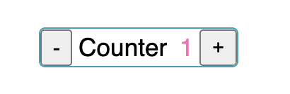
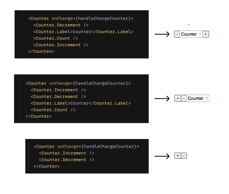
How is this more flexible you ask? Let's look at an example. We'll build a counter component with + and - buttons to increment/decrement the count.
The component API would look as such
<Counter onChange={handleChangeCounter}>
  <Counter.Decrement />
  <Counter.Label>Counter</Counter.Label>
  <Counter.Count />
  <Counter.Increment />
</Counter>
Flexible Markup Structure: Your component has great UI flexibility, allowing the creation of various cases from a single component. For example, the user can change the SubComponents’ order or define which one should be displayed.
Let's look at the implementation
import { Decrement, Increment, Label, Count } from "./components";

export const Counter = ({
  children,
  onChange,
  initialValue = 0
}) => {
  const [count, setCount] = useState(initialValue);

  const handleIncrement = useCallback(() => {
    setCount(count + 1);
    onChange(count + 1);
  }, [count, onChange]);

  const handleDecrement = useCallback(() => {
    setCount(Math.max(0, count - 1));
    onChange(Math.max(0, count - 1));
  }, [count, onChange]);

  const value = useMemo(() => {
    return {
      count,
      handleIncrement,
      handleDecrement
    };
  }, [count, handleIncrement, handleDecrement]);

  return (
    <CounterProvider value={value}>
      <div className="counter-wrapper">{children}</div>
    </CounterProvider>
  );
};

Counter.Decrement = Decrement;
Counter.Increment = Increment;
Counter.Label = Label;
Counter.Count = Count;
We start by creating a context and wrapping the whole component inside a ContextProvider. We pass our shared state and function to the context so that all child components have access to it.
<CounterProvider value={value}>
  <div className="counter-wrapper">{children}</div>
</CounterProvider>
Getting the state in the sub-components is as simple as reading from the context.
export const Count = () => {
  const { count } = useContext(CounterContext);;

  return <div className="counter-count">{count}</div>;
};
Here's this component in action:
Pros
- Reduced API Complexity: Instead of jamming all props in one giant parent component and drilling those down to child UI components, here each prop is attached to the SubComponent that makes the most sense.
- Flexible Markup Structure: Your component has great UI flexibility, allowing the creation of various cases from a single component. For example, the user can change the SubComponents’ order or define which one should be displayed.
- Separation of Concerns: Most of the logic is contained in the main Counter component, a
React.Contextis then used to sharestatesandhandlersacross all children. We get a clear division of responsibility.
Cons
- Too much UI flexibility: Having flexibility comes along with the possibility to provoke unexpected behaviour (putting an unwanted Component’s child, making out of order the Component’s children, forgetting to include a mandatory child).
4. Custom hook pattern
In this pattern, we use a custom hook along with the component template. All the logic needed for the component to work comes from this custom hook. This makes it possible for you to share logic without being opinionated about the UI.
Let's look at an example where we build a sample toggle component.
export default function App() {
  const { on, toggle, setOn, setOff } = useToggle();

  return (
    <div>

        <button onClick={setOn}>turn on</button>
        <button onClick={setOff}>turn on</button>

      <Toggle on={on} onClick={toggle} />
    </div>
  );
}
From the useToggle hook we get the handlers and state for the toggle switch.
useToggle hook can even be modified to pass props to it, to be used in the logic.
eg:
const { on, toggle, setOn, setOff } = useToggle({ initialValue: true });
Let's look at the implementation
export const useToggle = () => {
  const [on, setOnState] = useState(false);

  const toggle = () => setOnState((o) => !o);
  const setOn = () => setOnState(true);
  const setOff = () => setOnState(false);

  return { on, toggle, setOn, setOff };
};
Here's this component in action:
Pros
- Give more control: The user can insert their own logic between the hook and the JSX element, allowing them to modify the default component behaviour.
Cons
- Implementation complexity: Since the logic part is separated from the rendering part, it is the user who must link both. A good understanding of how your component works is required to correctly implement it.
5. State reducer pattern
This pattern is similar to the Custom hook pattern, but in addition, the user defines a reducer which is passed to the hook. This reducer will overload any internal action of your component.
Now, let's say we wanted to adjust the <Toggle /> component so the user couldn't click the Switch more than 4 times in a row unless they click a "Reset" button.
As a user, it'd be cool if I could hook into every state update before it actually happens and modify it. We can achieve this by passing a reducer to the hook. The reducer will have currentState and action as params. Then the action could have a type that determines what type of change is happening, and we could get the changes from the toggleReducer which would be exported by our useToggle hook. We'll just say that the type for clicking the switch is TOGGLE.
usage
export default function App() {
  const [clicksSinceReset, setClicksSinceReset] = useState(0);
  const tooManyClicks = clicksSinceReset >= 4;

  const { on, toggle, setOn, setOff } = useToggle({
    reducer(currentState, action) {
      const changes = toggleReducer(currentState, action);
      if (tooManyClicks && action.type === ActionTypes.toggle) {
        // other changes are fine, but on needs to be unchanged
        return { ...changes, on: currentState.on };
      } else {
        // the changes are fine
        return changes;
      }
    }
  });

  return (
      <div>
          <button onClick={setOff}>Switch Off</button>
          <button onClick={setOn}>Switch On</button>

        <Toggle
          onClick={() => {
            toggle();
            setClicksSinceReset((count) => count + 1);
          }}
          on={on}
        />
        {tooManyClicks ? (
          <button onClick={() => setClicksSinceReset(0)}>Reset</button>
        ) : null}
      </div>
Let's take a look at how we could implement this with our useToggle hook.
We could add logic to every one of these helper functions. However, I'm just going to skip ahead and tell you that this would be really annoying, even in this simple hook. Instead, we're going to rewrite this from useState to useReducer and that'll make our implementation a LOT easier:
const toggleReducer = (state: ToggleState, action: ToggleAction) => {
  switch (action.type) {
    case ActionTypes.toggle: {
      return { on: !state.on };
    }
    case ActionTypes.on: {
      return { on: true };
    }
    case ActionTypes.off: {
      return { on: false };
    }
    default: {
      throw new Error(`Unhandled type: ${action.type}`);
    }
  }
};

export const useToggle = () => {
  const [{ on }, dispatch] = useReducer(toggleReducer, { on: false });

  const toggle = () => dispatch({ type: ActionTypes.toggle });
  const setOn = () => dispatch({ type: ActionTypes.on });
  const setOff = () => dispatch({ type: ActionTypes.off });

  return { on, toggle, setOn, setOff };
};
Every handler fires a dispatch call to the reducer with the relevant ActionType.
We also want users to pass a custom reducer if they need to as a configuration object to our useToggle function, so let's accept that:
export const useToggle = ({ reducer = toggleReducer } = {}) => {
  const [{ on }, dispatch] = useReducer(reducer, { on: false });

  const toggle = () => dispatch({ type: ActionTypes.toggle });
  const setOn = () => dispatch({ type: ActionTypes.on });
  const setOff = () => dispatch({ type: ActionTypes.off });

  return { on, toggle, setOn, setOff };
};
See how we give a default value to the reducer in useToggle. The default value will be used if the user does not want to modify the default behaviour.
Okay, so now that we have the developer's reducer, how do we combine that with our reducer? Well, if we're truly going to invert control for the user of our hook, we don't want to call our own reducer. Instead, let's expose our own reducer and they can use it themselves if they want to, so let's export it, and then we'll use the reducer they give us instead of our own:
export const toggleReducer = (state: ToggleState, action: ToggleAction) => ...
Awesome, so now people can use our useToggle hook with their own reducer or they can use it with the built-in one. Either way works just as well.
Here's this component in action:
Pros
- Give more control: In the most complicated cases, using state reducers is the best way to leave control to the user. All your internal component’s actions are now accessible from the outside and can be overridden.
Cons:
- Implementation complexity: This pattern is surely the most complex to implement, both for you and for the user.
- Lack of visibility: Since any reducer’s action can be changed, a good understanding of the Component’s internal logic is required.
6. Props getter pattern
Custom hook pattern gives great control, but also makes your component harder to integrate. This is because the user has to deal with a lot of native hook props and recreate the logic on his/her side. The Props getters pattern attempts to mask this complexity. Instead of exposing native props, we provide a shortlist of props getters. A getter is a function that returns many props, it has a meaningful name allowing the user to naturally link it to the right JSX element.
Let's see how our Toggle example would look if we were using props getter pattern.
export default function App() {
  const { on, getTogglerProps } = useToggle();

  return (
    <div>

      Toggle state: {on ? "on" : "off"}
      <Toggle {...getTogglerProps()} />
    </div>
  );
}
getTogglerProps() takes care of passing the right props to the <Toggle/> component.
Implementation would look something like this:
const callAll = (...fns: Function[]) => (...args: any) =>
  fns.forEach((fn) => fn && fn(...args));

export const useToggle = () => {
  const [on, setOnState] = useState(false);

  const toggle = () => setOnState((o) => !o);

  const getTogglerProps = (props: any = {}) => ({
    on: on,
    "aria-expanded": on,
    tabIndex: 0,
    ...props,
    onClick: callAll(props?.onClick, toggle)
  });

  return { on, toggle, getTogglerProps };
};
getTogglerProps function makes sure that our Toggle component receives the toggle state, onClick action and also has the correct aria-label and tabIndex values.
If we want to override the default behaviour, all we have to do is explicitly pass the props to override to the <Toggle /> component.
<Toggle {...getTogglerProps()} tabIndex={-1}/>
Here's this component in action:
Pros
Ease of use: Provide an easy way to integrate your component, the complexity is hidden, and the user just has to connect the correct getter to the right JSX element.
Flexibility: The user is able to overload the props within the getters to adapt to their specific needs.
Cons
- Lack of visibility: The abstraction brought by the getters makes your component easier to integrate, but also more opaque and “magic”. To correctly override your component, the user has to know the list of props exposed by the getters and the internal logic impact if one of them is changed.
Conclusion
We looked at some of the core functional component patterns in React(that I know of). But in a real-world situation, you could build components that use multiple of these patterns together to make an extremely flexible API for situations where that's useful.
It is your role as a developer to choose the correct pattern corresponding to the right need. Whether to give the users of the component more control over the internal workings of the component or not.
This article was mainly inspired by the amazing work of Kent C. Dodds and Alexis Regnaud. Take a look at their blogs (Kent, Alex) if you are interested in knowing more about each of the patterns.
I hope you have found this useful. If you decide to try some of these patterns or need any help, send me a message on Twitter. I would love to help.